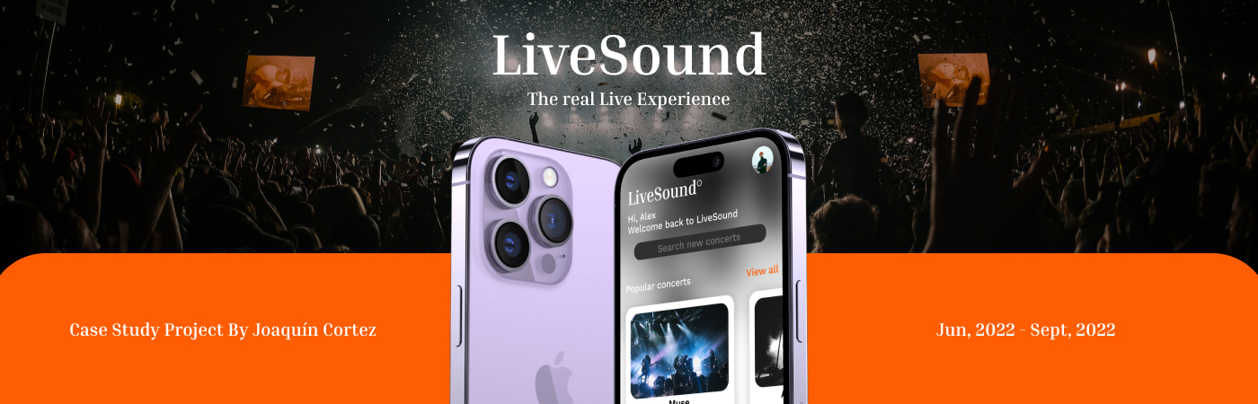
LiveSound:
LiveSound is a dedicated app designed to make music lovers' lives easier. LiveSound is a centralized platform where the user can browse different music-related events and book tickets directly through the app. The user flow is really simple and intuitive to make the whole buying process faster for the user, the app also features a digital ticket library where the user can find all the tickets and scan them directly with their phone.
The goal:
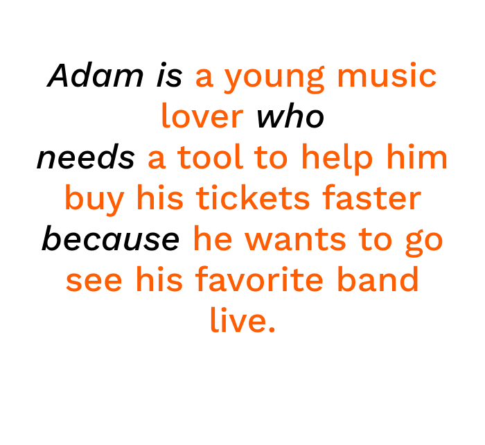
The goal with Livesound was to modernize and simplify the whole buying process. After doing research, one of the biggest pain points I found was that the process of buying a single ticket was really tedious and slow, and with the speed that the tickets are bought in today's world, users were having serious issues with tickets getting sold out before they could even get to the payment screen. My goal was to create an app with a straightforward interface that allowed the users to buy their tickets in a matter of minutes.
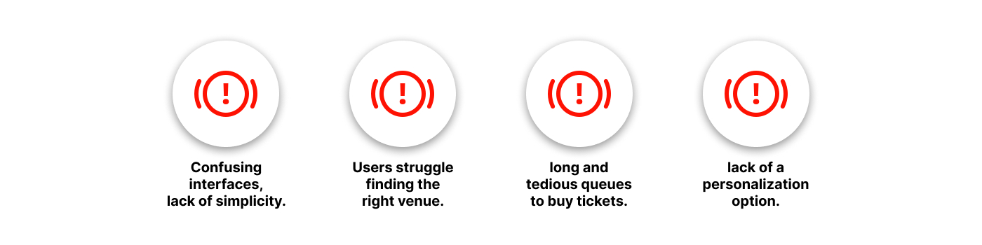
The main problem:
The problem was that users had to go through a lot of steps before actually buying their ticket, which sometimes took too long, making the tickets unavailable before they even got to the payment screen. Another big issue was that most apps would give the user external links or codes to redeem their tickets, and oftentimes, users would have to print their ticket in order to assist the event.
The process:
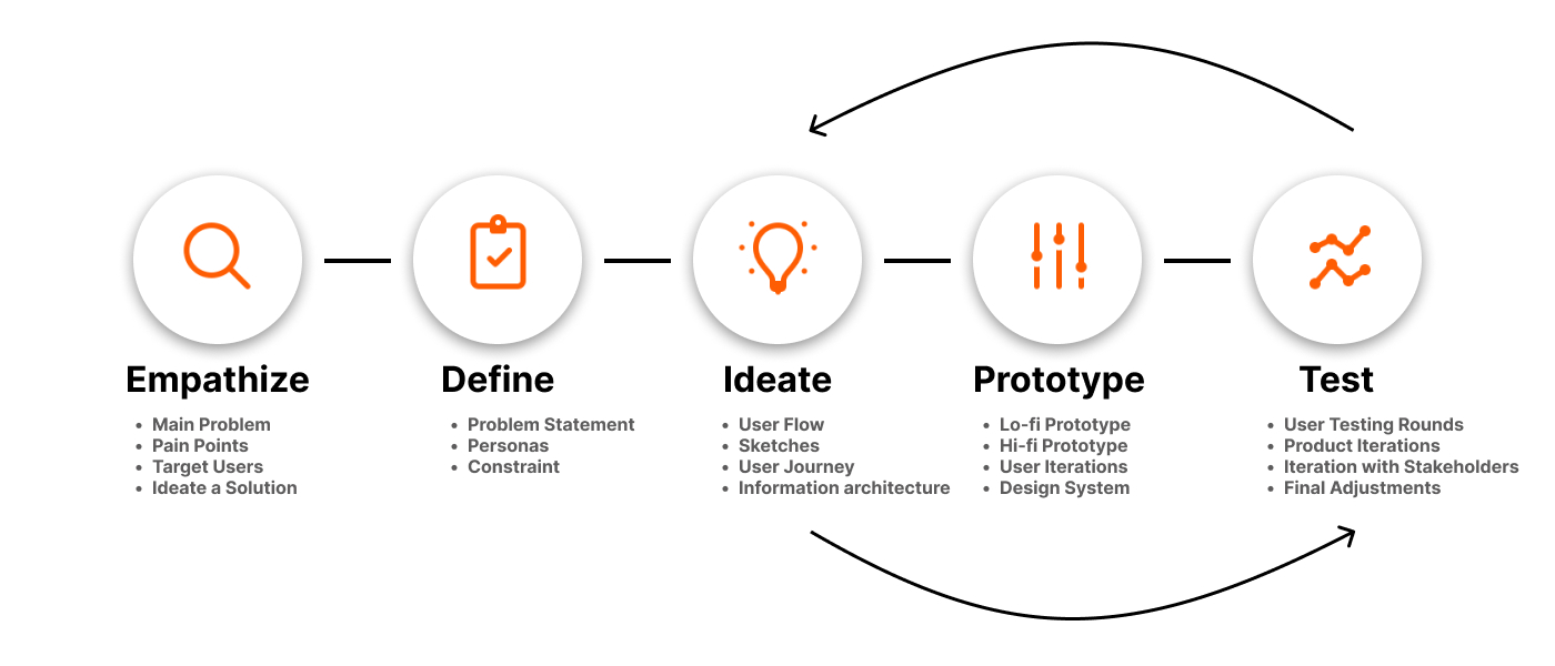
The project began with me doing research on common difficulties and imperfections existing apps had, then I proceeded to identify my target users, which were young adults between the ages of 20-30. After I had all this information gathered, I went ahead and defined the main user pain points.
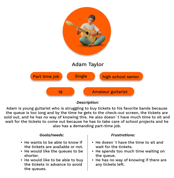
Then I proceeded to create a problem statement and design a persona to represent the target users, which usually struggled with the time they spent waiting to buy their tickets. Another big issue was that the pages would usually lag and close due to the high amount of traffic.
After defining the main constraints, and coming up with a first solution, which consisted of a dedicated platform that focused on making the buying process easier for the users, I went ahead and started creating what the main user flow would look like, the user journey through the app, the Information architecture (IA) of the app and I also started drawing the first rough designs on paper.
For the IA I decided to make it as simple and straightforward as possible to reduce time on task, long queues, and delays in the buying process.
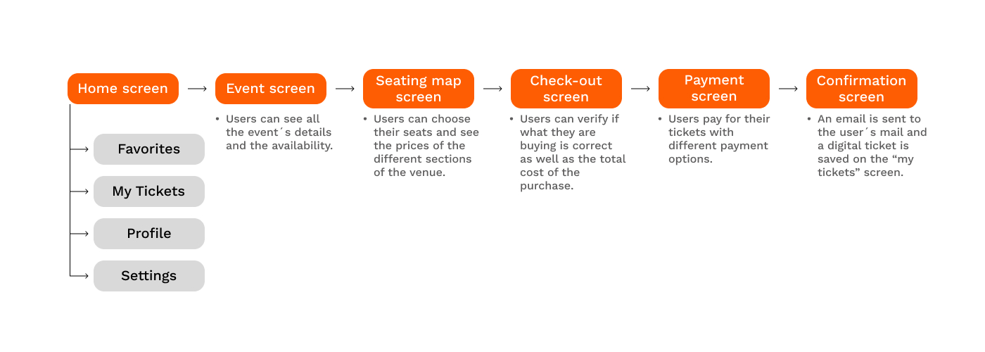
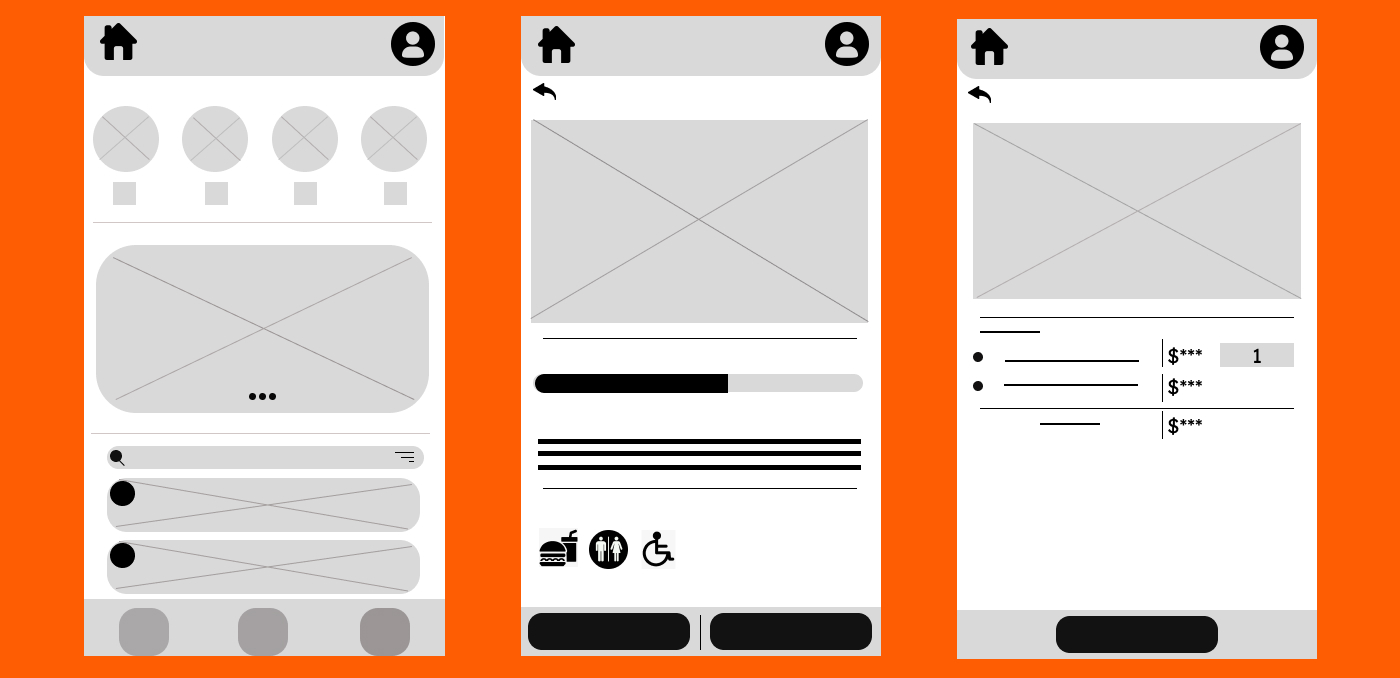
Once I was happy with the paper sketches, I jumped over to Figma and created the digital wireframes and the lo-fi prototype. My main idea was to make a central page with all the features the users could need, this included a "events" section, a search by location option, and a search bar for specific concerts.
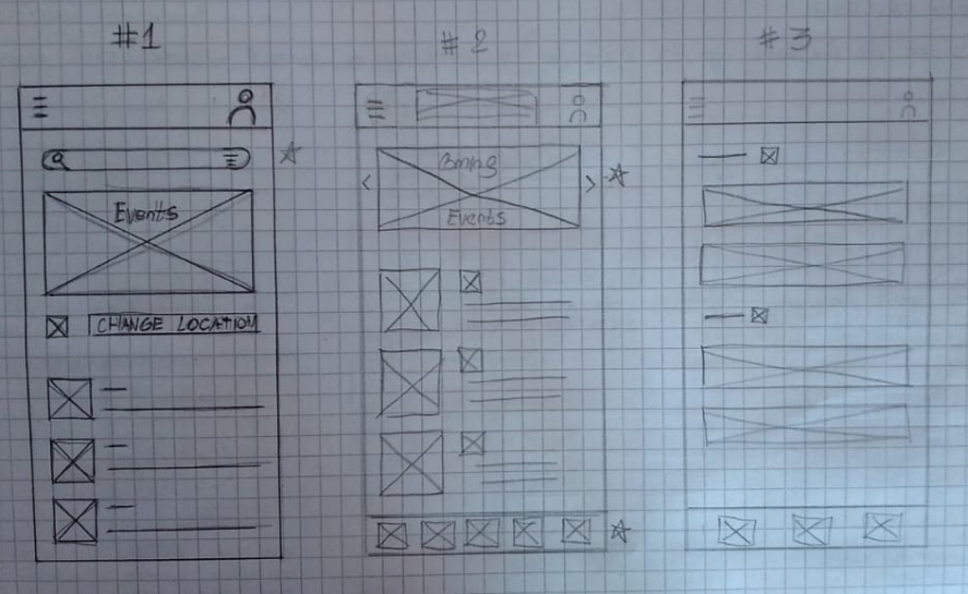
With the screen in the digital wireframes, I tried to only include the most relevant information the users could need, to declutter the screen and allow for a cleaner, faster scroll-through.
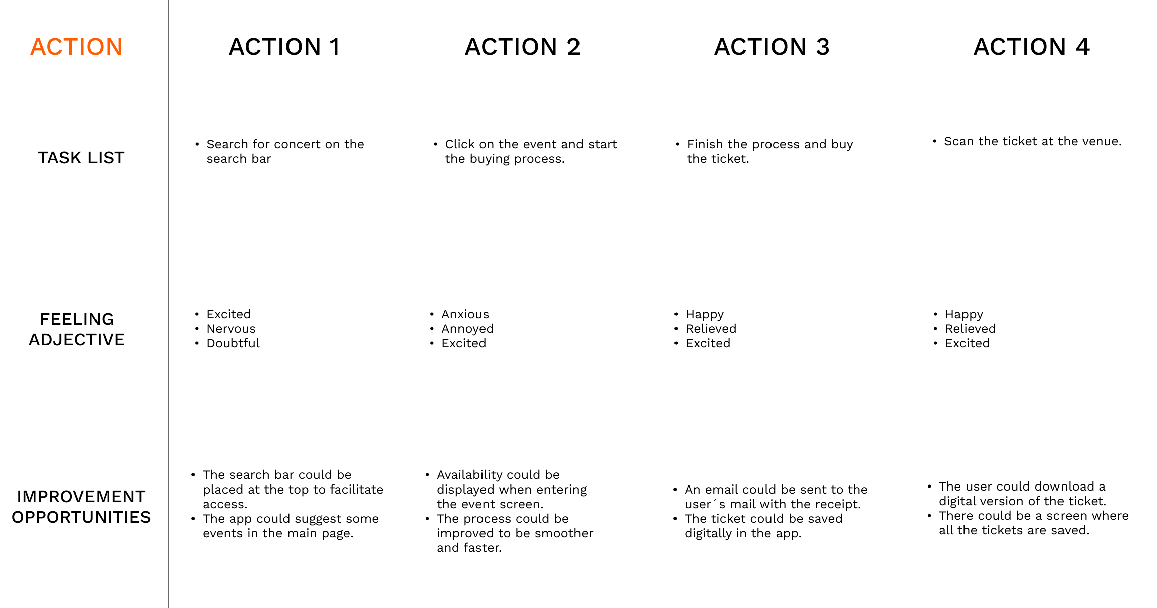
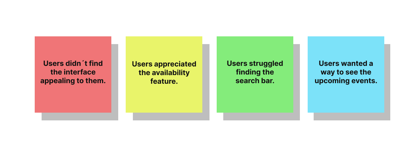
Then, I conducted a round of interviews with some target users, to test the prototype. I was looking for any issues understanding the main structure of the app, and trying to see if the users felt like some important feature was missing. I was also measuring the time the users spent on every task to see if there was any issue with the functionality of the screens.
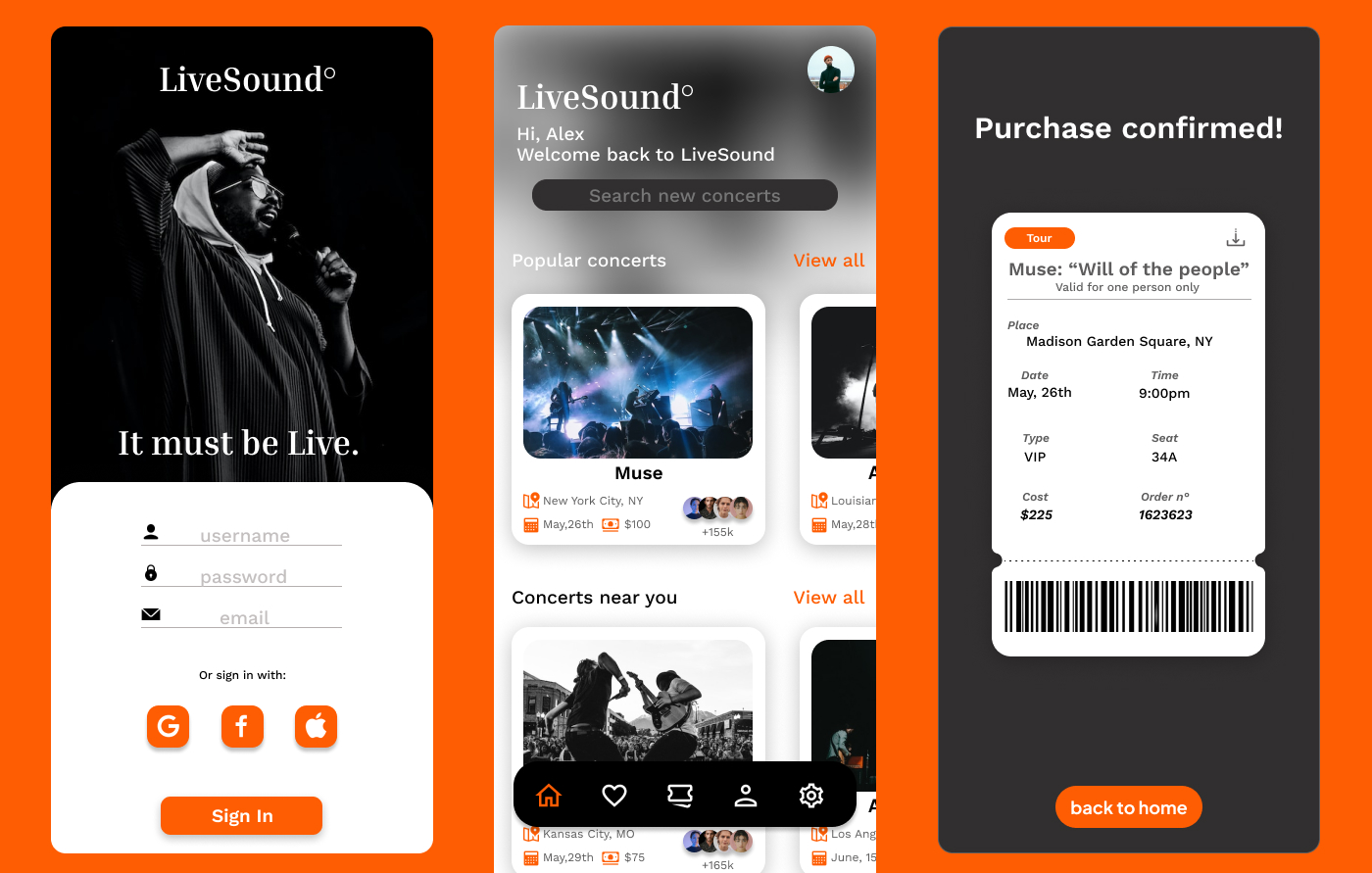
After the user testing, I made the big decision to re-designing the UI. I went back to the research phase and I studied in-depth the trends and likes of my target audience. After changing the structure and visuals, I came up with this version of the app featuring a more modern design, high contrast colors, and a really simple and modern design of the elements like cards and buttons. Once I had modified the design based on the user comments, I went ahead and created the hi-fi fidelity prototypes and the mockups for the app.
Constraints & difficulties:
When designing LiveSound, I came across some creative difficulties such as having to adjust the interface arrangement, colors, and overall design because it wasn´t appealing to the users. After fixing the issue and having more testing rounds, I realized that some features weren´t useful enough, users wouldn't consider them essential for the app, and at the same time, users were suggesting features that the app didn't have. So I had to re-think LiveSound´s interface and make adjustments to improve the app´s performance. This taught me to quickly iterate on my designs keeping always the users' needs upfront.
Outcome:
After polishing the last details, target users had the chance to try a live prototype of LiveSound, with all the new features included, and after the test, they had the opportunity to leave a review or comment on their overall experience. Some of the questions focused on the looks of the app, and the overall buying experience, and users were also asked if they would use Livesound and recommend it to their friends. The answers were positive. The main project goal was also achieved, reducing the overall buying time to just a couple of minutes.